Don’t know about you, but beauty brands provide some of our greatest design inspiration as of late. Whether it’s creative packaging, an innovative concept (we’re always obsessing over the latest in sustainable beauty at eco club), or altogether flawless branding, we obsess over beauty and skincare brands approximately 1000% more than we actually wear them. Today we’re sharing our admiration for a few particularly design-driven brands (mostly skincare, but for our purposes we’ll call it all beauty) and what makes them stand out to us.
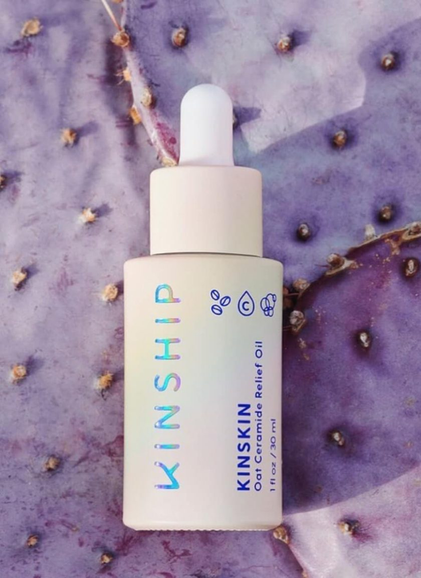
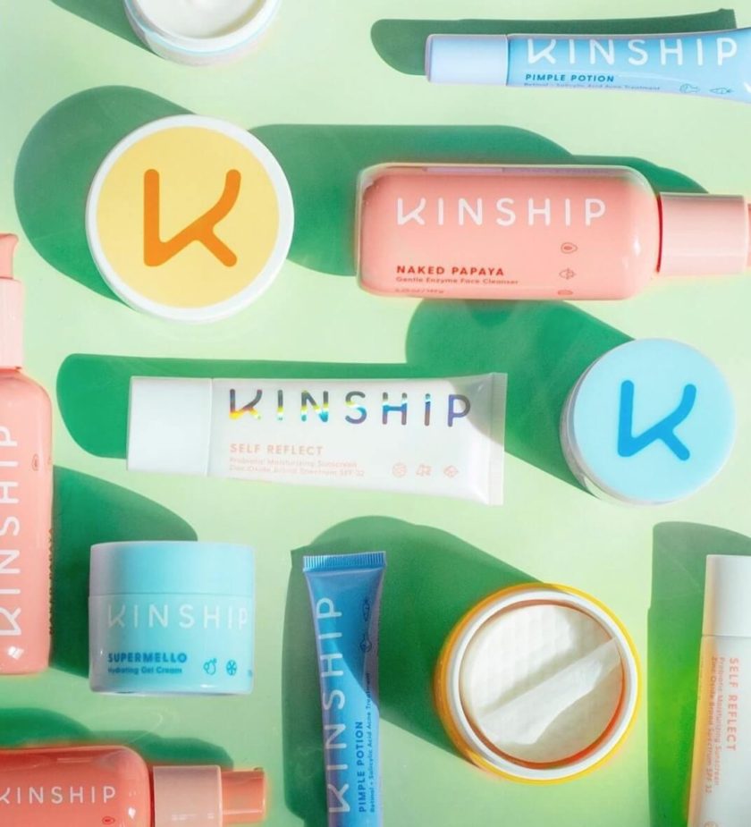
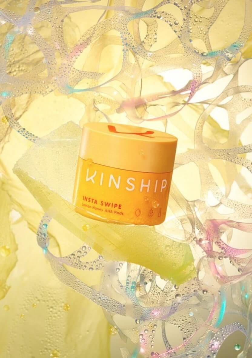
Kinship first came on the scene with their mineral sunscreen, and naturally we were mesmerized by their take on the holographic revival. Now, they have an entire skincare line made from conscious plant-based ingredients, and packaged in recycled ocean waste plastic containers (that you can recycle or send back for them to). On top of all that, they have THE cutest branding, a cheerful yet surprising color palette, and super cool product photography that makes for one impeccable Instagram feed.
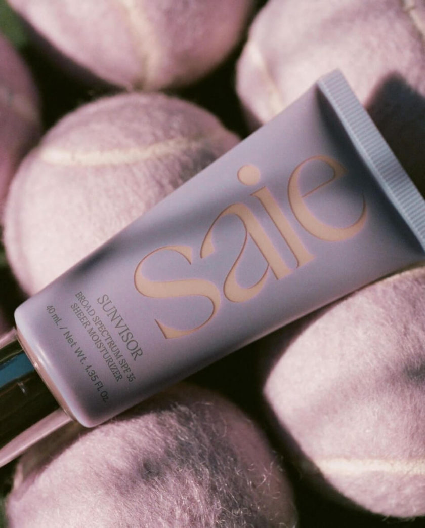
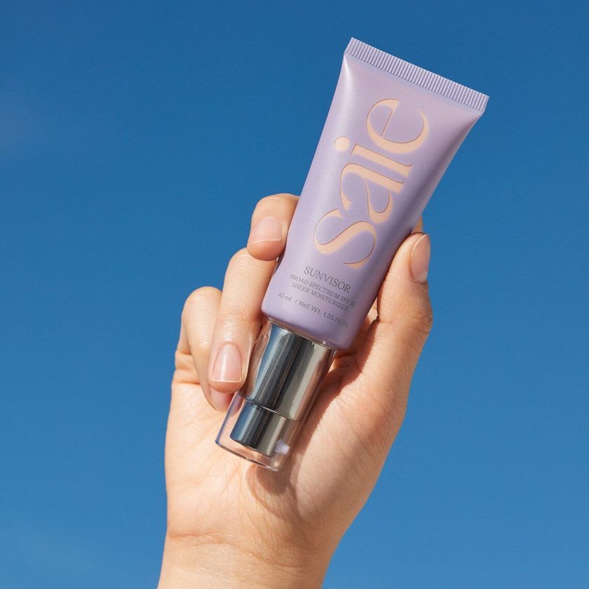
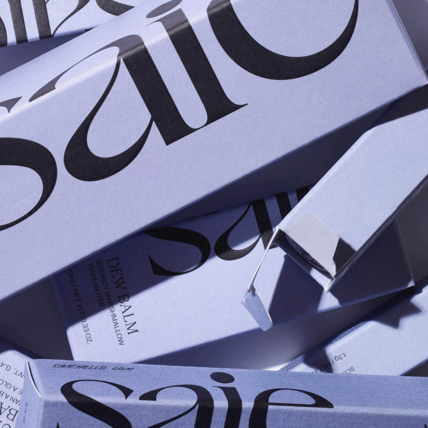
Saie‘s website gives me chills, and it’s only partially because this shade of purple is my favorite color (and the color of my bedroom walls). Their web design showcases their branding beautifully, with the perfect blend of refined and trendy, and none of it at the sacrifice of user experience. I love the shadow-y, ghosted flatlays featuring their beautifully clean product, fresh logo, and yummy swatches. (By the way, if you’ve ever tried to create a chic beauty flatlay like those on their site, you know that it takes ridiculous skill to make it look that effortless.) Also, how many beauty brands actually have “see full ingredients list” as a CTA on their homepage?!
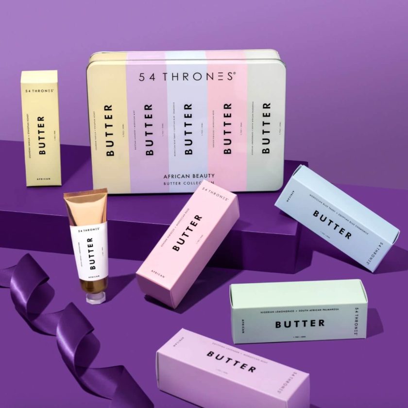
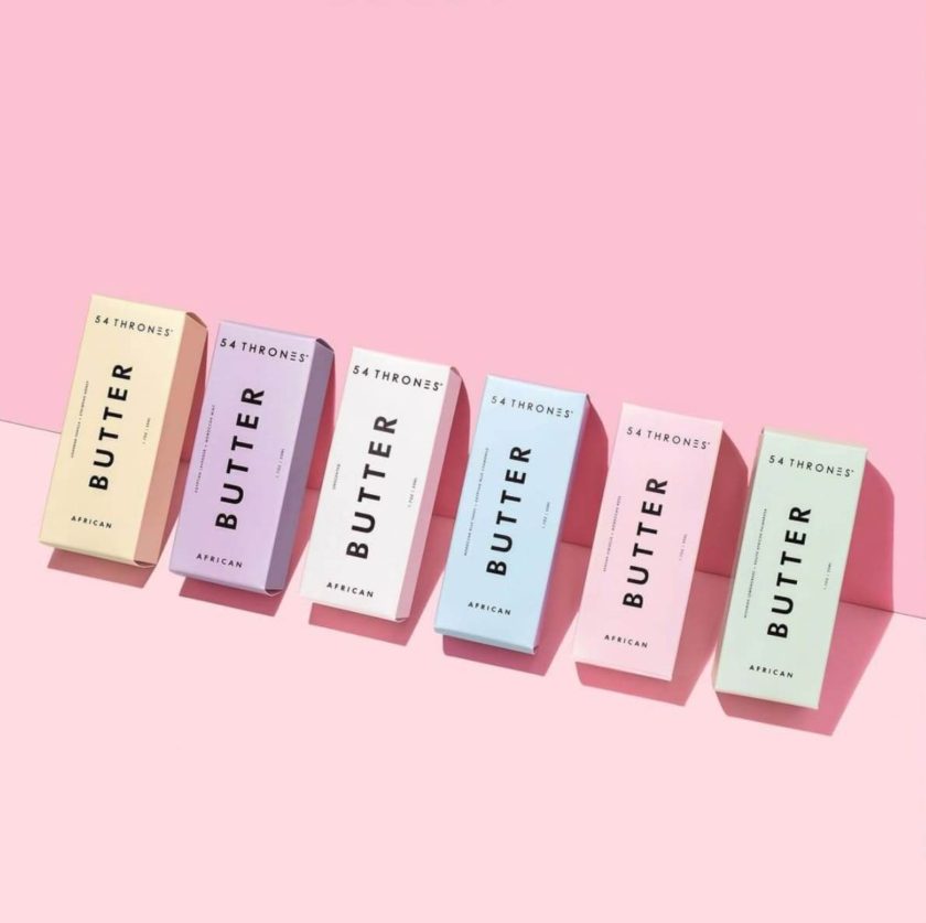
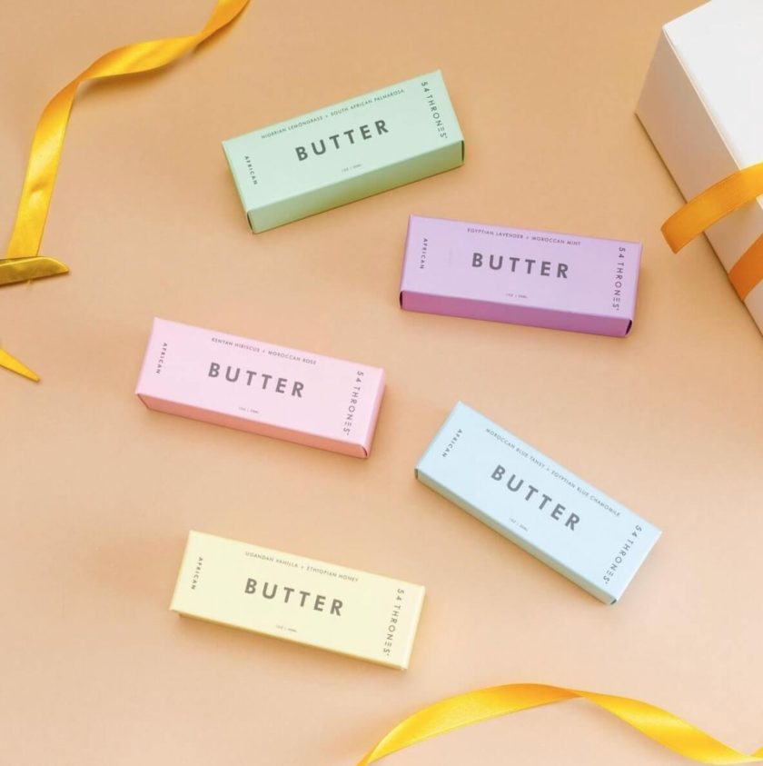
Oprah-approved 54 Thrones made waves last year with their luxurious African beauty butter, though they’ve been around since 2016. The company offers natural, authentic beauty products inspired by African healing rituals from generations past. They also offer skin and body oils, soaps, and bath products, pretty much all of which have won some sort of beauty award at this point. We love the pastel vibes of their stick-of-butter packaging too!
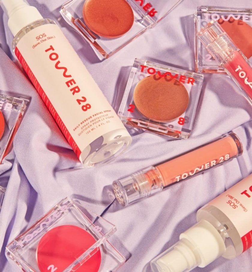
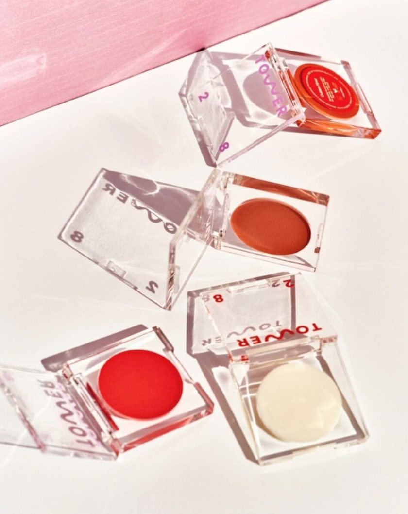
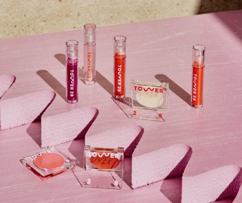
I recently treated myself to a few of Tower 28‘s offerings, and just like with everyone above, their branding and web design definitely influenced my purchase! With products designed for sensitive skin, they’re all about the idea that #ItsOkayToBeSensitive. Their photos are so fun, and how about that logo animation and palm tree cursor?!
Where do you get your design inspiration? Any other beautiful beauty brands we need to know?!

Leave a Reply