It’s been a minute since we shared our latest package crush here on wallflower, and yep, we’re going with another chocolate brand for this edition. In this series, we share all about packaging design that would totally make new customers out of us. I haven’t tried Markham & Fitz Chocolate myself, but if I happen to come across one of these bars while browsing the candy aisle, I could be convinced. Actually, all of their confections look just as lovely as the containers they come in. But let’s focus on these beautifully illustrated packaging designs, for now:
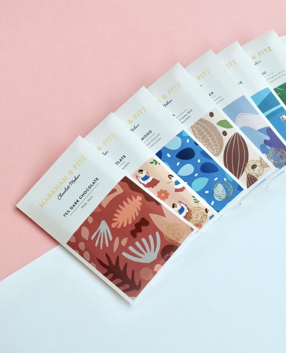
Markham & Fitz is known for “origin driven” bean-to-bar chocolate with beans from Haiti, the Dominican Republic, Colombia and Nicaragua.
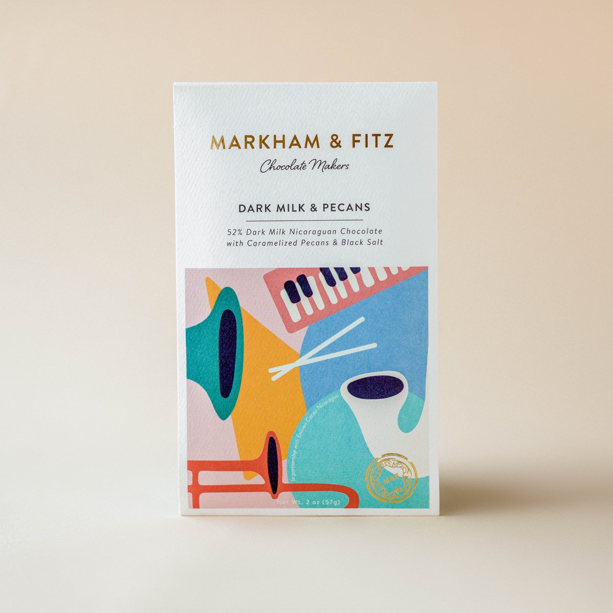
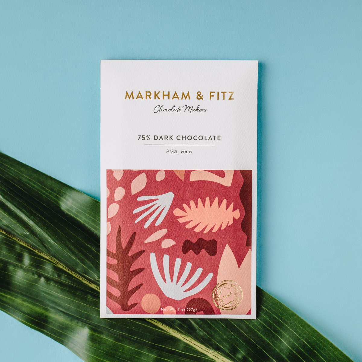
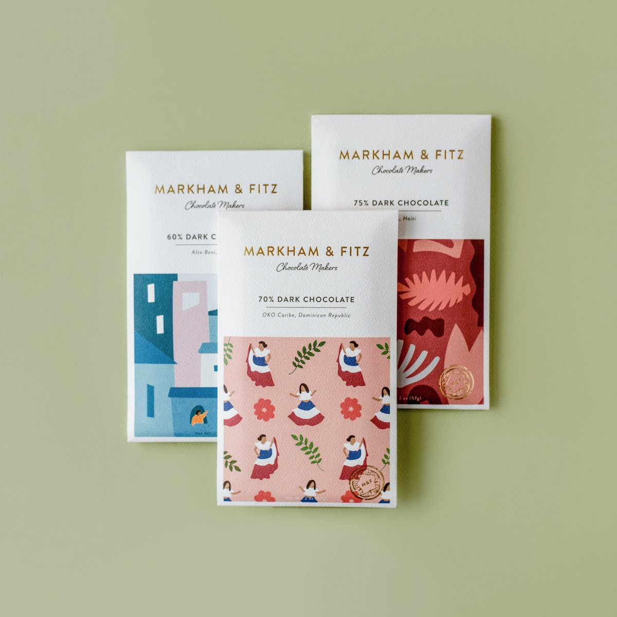
Each bar has a different look.
Will Echols is to credit for the whimsical illustrations.
Love seeing all the different designs together in a set, don’t you?
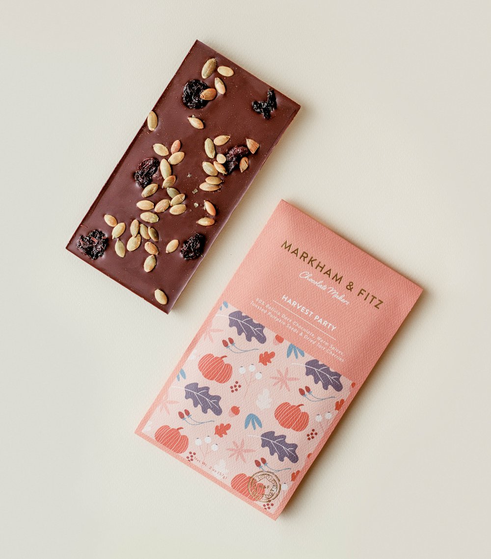
Of course, your bars have to be as delicious as your packaging! (Or is it the other way around?) This cheerful design for their Harvest Party bar is one of my favorites.
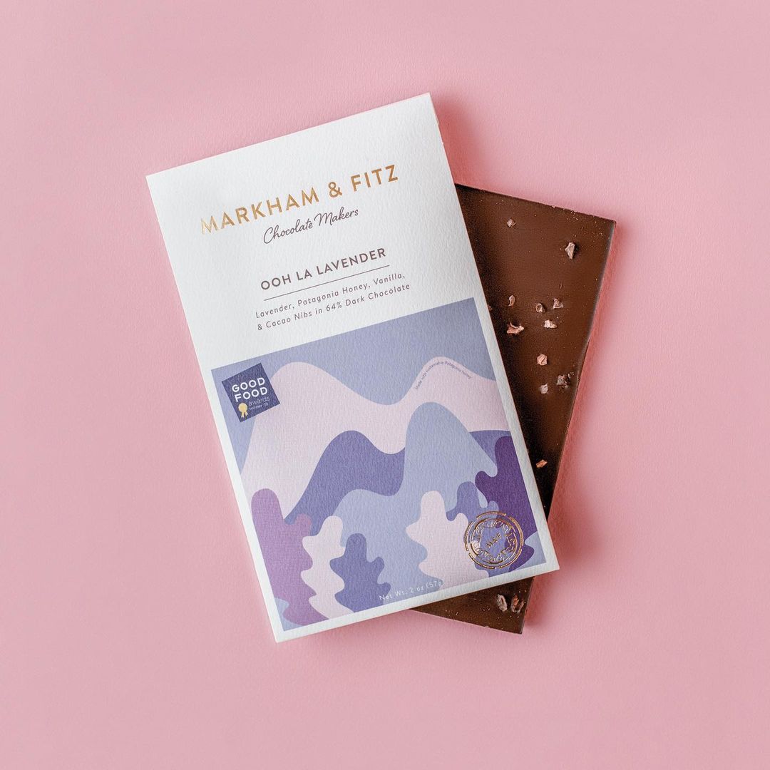
Oooh, lavender, now you’re really speaking our language.
Have you tried Markham & Fitz Chocolate? Find Will’s portfolio, here. And, tell us which brands have caught your attention lately!

Leave a Reply