Building out color-forward palettes to pair with Pantone’s 2026 Color Of The Year Cloud Dancer takes me back to the brand design stages of our business. We knew we wanted to lead with color, but we also know the importance of having a solid neutral in the palette. Actually, that’s kind of how we design all of our websites (then we let the client decide whether we need to tone it down or amp it up). I love contrast. It’s what gives color the space to shine. Still, when Pantone announced the Color of the Year 2026, Jenn and I had the same reactions as pretty much everyone else: Um, whaaaat?
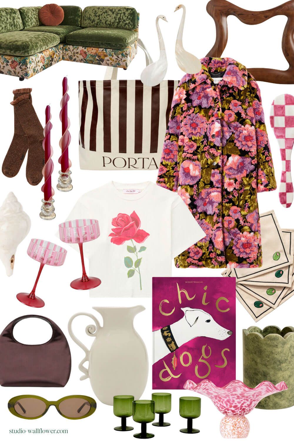
Color Palette 1: Cloud Dancer, Olive, Viva Magenta, & Chocolate
Custom Floral Green Velvet Couch by HiLo Brooklyn | Swan Mother of Pearl Serving Spoons | PORTA Tote Bag | Stems Brown Metallic Crew Socks | From The Hive Taper Candles | Olive Cocktail Napkins | Vaisselle Serveware | Cambria Mirror by Aimee Song | LED Table Lamp | Off White Shell Decor | Hand-Painted Pink Striped Coupes by Department of Gifting | Floral Coat | Lisa Says Gah Rose Tee | Loeffler Randall Chocolate Satin Bag | PORTA Vase | Chic Dogs Book | Marble Wine Chiller | Olive Polarized Sunglasses | Set of 4 Green Glasses | Pink Glass Blown Bowl
Whimsical as my style is (see here for my latest curation of clothing), I actually can appreciate a neutral-dominated color palette. Different shades of beige from white to cream can be quite comforting and signal tranquility. But featuring one as the Color of the Year seems counterintuitive, as often the purpose of neutrals is to fade into the background. To step back, and let the accent hues take the stage. So a lot of us were like huh? Leading with the neutral. How vanilla.
In Pantone’s defense, they do provide their own palettes with each year’s color, offering a jumping off point for what colors to pair with the winning hue. So Cloud Dancer isn’t wholly white.
While maximalism may not be as on-trend in 2026 as it was back in 2021, the concept of experimenting with color still leads when it comes to design and fashion, at least in our corner of the internet. Color and pattern and texture are all just as important, but now… after having our fun experimenting with maximalism, it seems like we’ve collectively agreed that these features do best when given a little space to breathe.
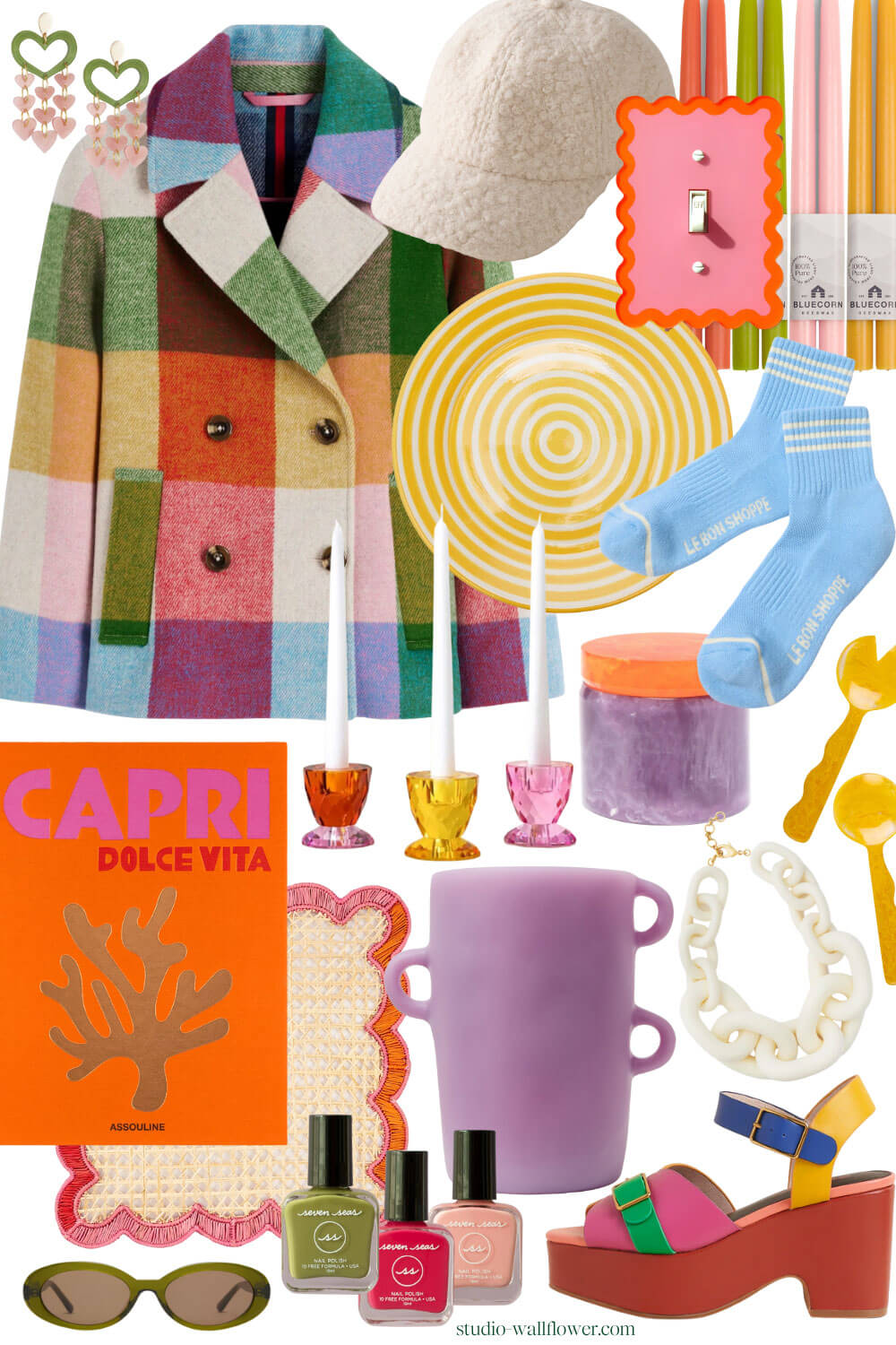
Color Palette 2: Cloud Dancer, Red Orange, High Visibility (Yellow), Greenery
Colorful Wool Coat | Pink + Green Heart Earrings | Boucle Baseball Cap | Squiggly Switch Plate Outlet Covers by Poppy & Hone Bee (Multiple Colors!) | Sustainable Taper Candles | Le Bon Shoppe Girlfriend Socks | Resin Salad Servers | Capri Dolce Vita Book | Colorful Placemat | | Lavender Vase | Orange & Purple Box | Colorful Crystal Candle Holders | Cloud Dancer Link Necklace | Olive Polarized Sunglasses | Trio of Seven Seas Nail Polishes from Wallflower | Charlotte Stone Platforms
So maybe that’s what Cloud Dancer is about. The space between expression, at least for us color-enthusiasts. And for some, it’s the entire canvas waiting to be filled, as one Dwell editor challenges us to view it as, acknowledging the many interpretations behind the decision to choose a very-almost-white for *the* color of the year in a year like 2025.
(I tend to agree that choosing white feels like the opposite of what we need in 2026, it feels divisive rather than inclusive, but Pantone has suggested thinking of it as a fresh start, which does also feel like an apt interpretation.)
“The power of Pantone’s color of the year is that it sparks a conversation—a conversation everyone can take part in. At Pantone, we don’t dictate that conversation, we facilitate it.” Pantone President Sky Kelley
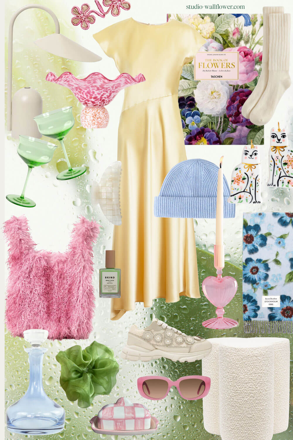
Color Palette 3: Cloud Dancer, Pale Banana, Dutch Canal (Blue), Tickled Pink, Foliage
Floral Napkin Rings | Chartreuse Nail Polish | Yellow Satin Dress | The Book of Flowers | Flower Sneakers | Pink Heart Taper Holder | Cashmere Beanie | Fuzzy Pink Bag | Acne Scarf | Cat Earrings | Estelle Glass Decanter | Room Shop Cloud Scrunchie | Check Butter Dish | Pink Sunglasses | Boucle Ottoman
It should probably be noted that most of the people commenting on Cloud Dancer’s place in society are not interior designers, who are typically the primary group of people actually putting Pantone’s direction on color systems to work. Nonetheless, the critiques are valid, and it was both entertaining and intriguing to see the reactions posted on social media in the days following. I’m no interior designer (I design websites!), so my voice isn’t necessarily from that perspective either. I chose a mix of fashion, home decor, and lifestyle objects to create the color palettes mostly because I wanted to express my ideas with easily accessible images, and it’s always fun to see how designers and brands use trends in their products.
This last color palette is perhaps the most aligned with wallflower as a brand, “elevated whimsy” is our vision. We like to keep it playful but the goal is always first and foremost to keep it thoughtful.
Leave a Reply